Monday 14 March 2011

Final Poster


This is my final poster design, as I have explained in both my sketchbook and previous blog posts that the idea behind the poster is a present/box which is containing the information is bursting out to express the celebration of a century. I didn't think that it was necessary to have the '100' years much larger than any other part of information on the poster. I wanted the information to be all in one place so you can take it in.

The colours that I used were intentional, using the rainbow spectrum of mainly primary colours contrasts brilliantly against white. Rainbows are associated with fun, also the way that the paper is put together is fun with the use of spiral clouds.

The layout is very central, the type and the main focus of colour are either in the centre or leading to it. The type is clear and not one is more distinguished than the other, that was my approach because all the information is considers important and I felt that the viewer shouldn't to be perplexed in order to obtain the information. 

The poster would attract viewers because not only the contrast of colours but also the curiosity of what the poster is all about. Only after reading it they would understand that it's about the company and then shortly realise after that it's made from paper and make that connection.

I felt that this poster not only met the briefs requirement but my expectations because this poster oozes creativity and viewers can see this poster and it would spark ideas for their own work for inspiration.

Possible compositions for Final Poster...

All of these photos were developed that tiny bit further on photoshop using the levels and cropping tool...


For some unknown reason my red in the poster was really dull so I slightly edited it so I could make the red more vibrant and I did this by changing the saturation of the 'reds' within the image.

I took about 30 different photos of this set-up just at different angles, most were just the wrong angle exposing points which I didn't particularly want to shoot. Also, I was focusing at the wrong points, it was either too dark or too light. But eventually when I got used to the camera and had it set up on the correct exposure and everything that goes with it. I came up with these three shots, it's just a matter of which one to choose and why?


I like the white balance in this image but the angle deter you away from the font, and focuses on the box itself which is not the case. Plus you can see the joins in the card which is more evident and makes it look badly made, I could get a better shot. Also the layout of the poster, the type being to top left, it's not the balanced strong layout I am looking for, seen as I would like the viewer to obtain all the information clearly.


 I like the clarity of lighting in this image, the shadow which is casted from the box also the brightness of the white balance but the where the type is situated. There is too much empty space surrounding it and looks like it needs something else to fill up the space.


After much consideration I feel that this is composition which works best. I feel that my aim of balanced/strong type grid with the type in the centre of the poster, nothing around the edges for the viewer to get distracted away from the information. Also, the striking colours lead from the bottom to the top of the set-up which results in the viewer reading the information. I like the lighting which is really crisp and white then it gradually degrades to a soft grey. Also changing the saturation of the red really made it have the ultimate contrast.

Making of GF Paper poster....

First of all I prepared the cube, just made simple square shapes with tabs on the edge so I could glue them together for a more sturdy box.


Then using thin coloured card I prepared the coloured spiral clouds by drawing them out and using a craft knife to cut them out. Then between each layer using foam stickers which will give it that added bit of depth.


Then there was to add the text, because they were too small to cut out by hand to make them look good quality, I used a laser cutting machine. Learning to use that piece of machinery was the most useful skill ever, it has opened up so many opportunities, making future ideas easier and more economical for my time.


Then simply sticking a piece of stronger plastic to help support the weight of the cloud. The structure is complete.


experimentation continuing....

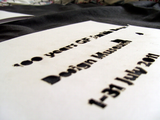
My main aim to complete this task was to show what you can do with a simple piece of paper and represent information in the most creative and interesting format. Creating type from it by stencilling or actually creating the letterforms from the paper. So I have captured some of the experimentation in progress...


Exploring this as an option was sucessful but felt that it wouldn't really suffice to show the excitement of the celebration of a century for a well established company. But at least I am exploring and developing of skills of bending, cutting out stencils from the paper. Not only that skill but forever improving on my photography skills. A number of things which I had to consider whilst taking the shots, light, shadow castings, correct settings on the camera which would give me the correct exposure, aperture and also white balance of the shot. Each setting would give a different 'mood' to each photo even though it would be the same object and this would be important for the viewer of the poster.

I liked this idea, quite a lot,however when I was browsing along other peoples blogs and I was seeing similar stencil cut out of the 'GF Smith' and '100 years' so I felt I needed something fresh just to fulfill the briefs requirements of being very creative. Then I started looking at greetings cards and their method of layering, and using card...


The method of creating a stencil and layering them on top of the using sticky foam tabs to create depth will make a 2D piece much more nicer to photograph because there is that little extra bit of depth which will cast a shadow. 

So I was beginning to think about what a celebration is linked to...


All these party connotations could be incorporated to this project because most of them involve paper to make them. So I started creating quick sketches...


The idea of a present, that element of surprise! Is a nice idea that the this box is trying to contain the excitiment of the celebration of a century but what if the content of the box wants to burst out to show you what's inside?!


Paper sculpture, DONE.


These photos are on a black background to see the real contrast...


The next few images have been photoshopped to create that illusion of a human egg cell under a powerful microscope. Using an edges filter, it uses illuminious colour to pick up the edge of shapes much like the powerful microscopes to view miniscule objects.


Monday 7 March 2011

One day I hope to be as good as these people....

In this post, I am just going to show you various images of some designer work which really motivates and inspires me. I may touch upon some that I have already mentioned in previous blogs. But can you really blame me for like of....

Yulia Brodskaya


Her use of colour really makes an impact on the viewer because it screams, 'LOOK AT ME!'
The method of quilling which is extremely tricky, but she seems to have so much control, not only by creating perfect shapes but also creating form, the consideration of blending of colours. That certainly takes some skills.


These two images above look like they could possibly be made out of paper, constructing actual type in a 3D form followed by a sharp photo to really set the information off by the use of subtle highlight lighting to the darker shadows. All of there work on there website is fresh to the eyes and there is such a great variety of practices demonstrated on there.


The set of images above are from a design group called Serial Cut. They are a company which produce images which are linked with current or past events, they believe that the best combination is type and image and also that typography is the most important part of the end product. I can take some ideas from there work by how the photograph it and there consideration to composition.


Thursday 3 March 2011

GF Papers....

Whilst my end piece is in the making still... I am going to make a start on Task 2 of the brief and start thinking about the poster which celebrates that GF Papers has been an established company for 100 years. The brief requires us to create a poster...


- A2
-PORTRAIT
- MUST CONTAIN THESE WORDS....

 100 Years of GF Smith Paper
Design Museum
01-31 July 2010

The poster must be as creative and inventive as possible..... no problemo!
The poster must show the possiblities of what paper can do.
The poster MUST be photographed in a professional manner.

So as a starting point I took a photo from my development work from draft 3D scultpture...

Then using photoshop, adding text and editing the photograph so that it could fit the briefs requirements....

We have to consider grid frames so that it identifies whether the type is the main focus or the image. Consideration of colour, keeping it to a minimum of three colours? This was only a starting point, if I am honest, if I saw that on a wall I probably wouldn't give it a second look. The most interest aspect of this poster is the image but, it was a start to get to grips with grid frames of type.

I need to create posters which really captivate the viewer and make them think "Wow, that's just paper and look how it can look?!" 

However I tried another photoshopped photograph from developments...

Before....

After


This poster, I was taking an experience from a previous workshop for Obs&Comms, to show a grid form which screams a bonkers approach to the type. I used helvetica typeface on this poster because this relates to their website, it looks like the font that they use. The poster contains all the information required but not presented in a form in a way not like most posters. Instead of reading it left to right, it can be read as you turn the poster. So something to take away from this poster idea, just because it has a slightly bonkers approach doesn't mean that it is illegible, the viewer can obtain all the information required. A point to consider in mind....

After doing these two posters, I don't think this approach is really for me, I feel that I could meet and probably exceed the briefs requirements creating my own poster using my own skills then photographing them.

I will start a new blog for a new idea....